Jenna Chen

SouvenAir


Native application that allows Airbnb patrons to document and share their travel experiences with fellow travelers, families, and friends

 
Screens
 

Duration

3 Weeks


Role

UX Designer
(Owner’s Experience)

Tools

Adobe XD | Wire-framing | Prototyping | Visual Design


Teammate

Trucdan Nguyen (UX Designer)


illustration 1

Project Background

Due to COVID-19, many people have paused their travels and quarantined.

As travel restrictions start to relax, we want to inspire customers who book experiences through Airbnb to document their travels, trips, and stories to share with families and friends. We expanded on the prompt given during the Airbnb x Adobe Creative Jam by exploring ways to help travelers co-document experiences and creating both a creator’s and a viewer’s experience.


Understanding User Needs

(participants were 10 interviewees, ages 20-62)

Before deciding on the features of the application, I sat down with 10 individuals, all familiar with Airbnb and interested in traveling post quarantine, in order to better understand their frustrations with sharing travel experiences with their peers through their mobile devices.

“As a traveler who likes to explore new food locations and restaurants, I would like to be able to share new store findings with my friends so that they may explore them as well.”

personas-03.jpg

“ As I travel, I want to be able to take pictures of the places I visit and to document the places I go to easily and quickly.”

“As someone who travels often with friends, I want to be able to share our memories together and be able to collaborate on the documenting process.”

Key Findings

I gathered 4 main insights surrounding the autonomy of sharing and adding friends to a trip.

Add friends to a trip documentation to share memories and co-edit a trip

Add a memory spontaneously or from your photo album for your fellow travelers to see

Check in to a destination so your friends and others may see where you have visited

Add a live story to let others know what you are doing, when you are doing it


User Interface

The objective of the interface is to be playful, inviting, and navigable. This is achieved through the use of large photos, colorful icons, rounded corners, and minimal text.


Low Fidelity Wireframes


High Fidelity


Features

1. Add New Trip

The host can start documenting a new trip through a current booking from Airbnb.

New Trip
 

2. Add Friends to Edit Trip

The host of a new trip can add fellow travelers to the documentation process so that they may view current events, add memories, and check-in to locations.

AddFriends.gif
 

3. Add a Memory

A traveler can share a photo or video spontaneously by using the add memory feature to access the camera or to select from their photo album.

Add Memories
 

4. Check-in to a Destination

A traveler can check into the destinations they are visiting to allow viewers to see all the places they visited during their trip.

Check In
 

5. Add a Story

A traveler can add an image or video authentically and spontaneously to their story on their profile for viewers to see.

Add Story

Usability Testing

(participants: 6 interviewees - Ages 21-58)

The first round of usability tests was conducted with the high fidelity prototype of SouvenAir in order to identity pain-points and/or problems that users may experience as well as discover potential opportunities to improve the design.

The usability tests were conducted with 6 individuals in a moderated setting. I asked each interviewee to perform the same 6 tasks and categorized their performance. In addition, I asked each interviewee for their thoughts on each task experience.

guerilla testing

Highlights and Takeaways

  1. Users want to be able to add friends using their email as opposed to a phone number

  2. Users want more guidance when checking-in to a new location

  3. Users want to the ability to add a specific individual, who may not be part of the larger trip, when they check-in to a location


Final

Mockup_2.jpg

You can check out the prototype here!

 
Mockup_3.jpg
 

Instagram Hide Feature

Feature that allows a user to hide image(s) within a multi-image post

Mockup1.jpg


Duration
3 Days

Role
User Experience Designer

Tools
Figma, Wire-framing, Prototyping

Teammate
Trucdan Nguyen (UX Researcher)


Problem

Instagram does not have a feature that gives users the option to archive individual photos within a multi-image post. As of right now (May 2020), Instagram is limited to two options: archive the entire post or delete the entire post.


Solution

The Hide feature will allow users to archive or delete an unwanted photo within the multi-image series, while still keeping the original post visible on the user’s profile. This eliminates the need to archive an entire post because of one unwanted photo.


User Research

The user research was conducted with 15 participants including high school students, college students, and young working adults. Ages 16–24.

“Instagram needs to make a feature where you can take down one individual picture from posts with multiple pictures in it.”

“As someone who enjoys sharing multiple photos at once, I want to be able to make changes after posting all
of them.”

“It is frustrating to feel the need to archive the entire post just because I’m not able to delete the one photo I don’t want there anymore.”

“I want the ability to edit what’s on my profile regardless of whether it was posted in a group or not.” 


User Flow

User-Flow.jpg


Final

The Hide feature allows a user to archive or delete an image within a carousel of images without deleting the entire post.

This gives a user the flexibility to further customize their feed at any point and adjust their posts how they please.

Mockup2.jpg

*Project conceived before feature was brought into Instagram on iOS

 
Mockup3_largerBackground.jpg


Seagate’s Amazon Store

Web redesign of Seagate’s Amazon web store to increase click rate, product engagement, cart size, and sales


Home Mockup


Duration

5 Weeks

Role

UX Researcher | UI Designer | Visual Designer

Tools

Adobe XD | Adobe Illustrator | Adobe Photoshop | Wire-framing


Overview

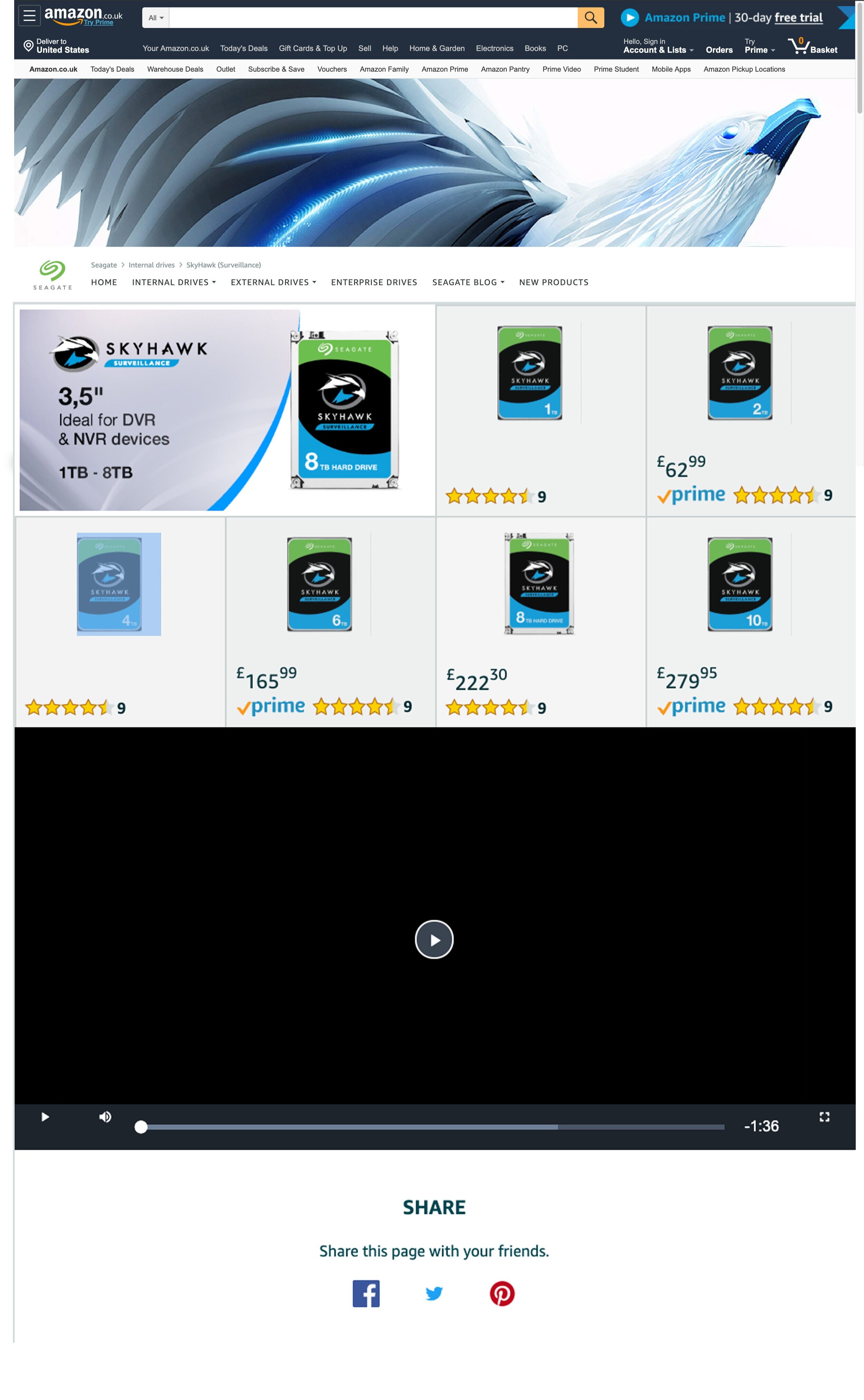
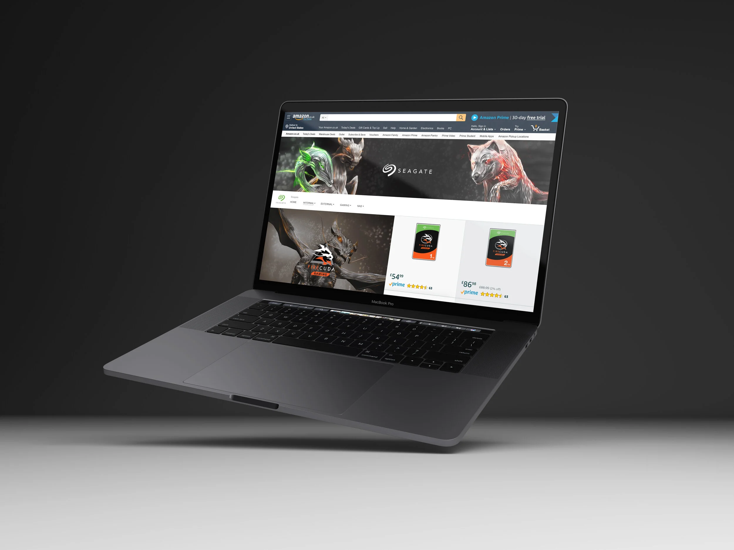
During my time at Seagate Technology, I had the opportunity to redesign and reimagine the Seagate web pages on Amazon. For this project, I created a series of low and high-fidelity wireframes as well as designed new marketing graphics for each segment of the web store.


Problem

The Amazon Seagate web pages were outdated with old graphics and out of date products displayed. Seagate’s Amazon store needed to be reimagined to incorporate up to date products, new marketing tiles, and simpler navigation

Solution

In order to create new Amazon pages, I created new marketing graphics, leveraging assets that customers were familiar with. In addition, I wireframed different layouts that would make the user experience as efficient and navigable as possible.

Old Seagate Amazon Web Store

Information Architecture - Navigation

After working with stakeholders to decide the categories within the navigation bar, we proceeded to layout sub-categories and blueprinted which specific products would fall into each section.

informationArch.jpg
colors-04.jpg

Low Fidelity Wireframes

Amazon High Fidelity Mockup 1
Amazon High Fidelity Mockup 2
Amazon High Fidelity Mockup 3

Internal / External Product Pages


NAS Landing Page

 
NAS
 

Gaming Product Pages

SSD.gif
Gaming.gif

 
Final Mockup
 
 
mock2.jpg
 

MySeagate

An internal mobile portal application that hosts employee resources in one designated area


Duration

July 2019 - September 2019

Role

UX Researcher | Product Designer

Tools

Adobe XD | Prototyping | Animation | Visual Design


Problem

Seagate does not have a mobile application that allows employees to access resources found on the Seagate website so employees have to navigate multiple web pages to find information.

Design Opportunity

MySeagate will include a wide variety of employee resources that will be accessible from a mobile device. In addition, it will also serve as an important resource for new hires to reference during their first weeks.

illustration 1

Understanding User Needs

(Participants: 5 Interns - 5 new hires - 5 seasoned employees)

In order to better understand what key features to include on the dashboard, I spoke with 15 individuals about their experiences and frustrations with daily tasks at work.

”As a recent hire who needs to view different benefit options, pay days, and pay roll, I want an easy one-click option to access and view my information through my mobile device.”

”As an intern who finds myself getting lost quite often, I want a corporate map that helps me get to specific meeting rooms so that I may easily navigate through the building.

”As a new hire at a company with a wide portfolio of different products, I want a product and category overview in order to better understand different segments that I would be working with.”

”As a long time employee, I want easy access to Webex on my phone so that I may join my meetings whenever and wherever I want.”


Key Findings

I gathered 5 key insights and points that the employees expressed surrounding daily tasks at work.

 
  1. Webex for easy meeting access through a mobile device

  2. Product Training in order to better understand the different sectors and products of the company

  3. Employee Contact Information

  4. Maps of Buildings to find specific meeting rooms

  5. IT Services for quick assistance on technical difficulties


User Personas


User Flows

Seasoned Employee

New Hire/Intern


Low Fidelity Wireframes


User Interface

Moodboard

Wireframe Flows


Dashboard Features


1. New Hire Onboarding

New hires and interns have easy access to onboarding training through MySeagate. Each time-sensitive task will have markers to help remind new hires to complete them.

Onboarding


2. Webex

Employees have quick access to join Webex meetings through MySeagate with their Seagate credentials.

Webex


3. IT Service Access

Employees can submit a ticket for assistance to IT services as well as receive direct help through the app.

IT Services


4. Weekly Menu

Employees have access to the weekly cafeteria menu.

Cafeteria Menu


5. Maps

Employees have access to building and floor plan to navigate around the office and to find conference rooms.

Maps.gif


6. Employee Directory

Employees can find the contact information of other employees by searching their name, team, or location.

Employee Directory


7. Daily Company News

Employees are able to view daily company news.

News
 

Final

Onboarding
News Mockup
Directory+Mockup

view the prototype here

 
Home_News_largerBackground.jpg